
Packaging Trends
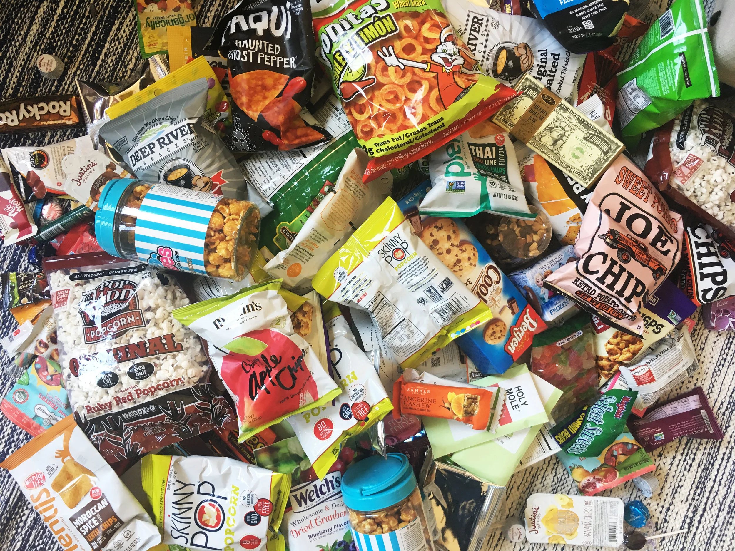
In the world of packaging, the prevailing trend seems to be "more is more," a cacophony of colors and chaos that begs the question: when did excess become the norm? The aftermath of my visit to the Chicago Sweets & Snacks Expo captures this frenzy perfectly—a visual cacophony of noise and clutter. Amidst the chaos, the Million Dollar Chocolate Bar catches my eye, not for its taste, but for its audacious branding. While it certainly stands out, I can't help but wonder: is it genuine?
One notable trend amidst the sea of vibrant hues is a welcome reduction in snack ingredients. With sugar intake a concern for many Americans, the emergence of natural fruit-infused and organic candies is a refreshing sight.
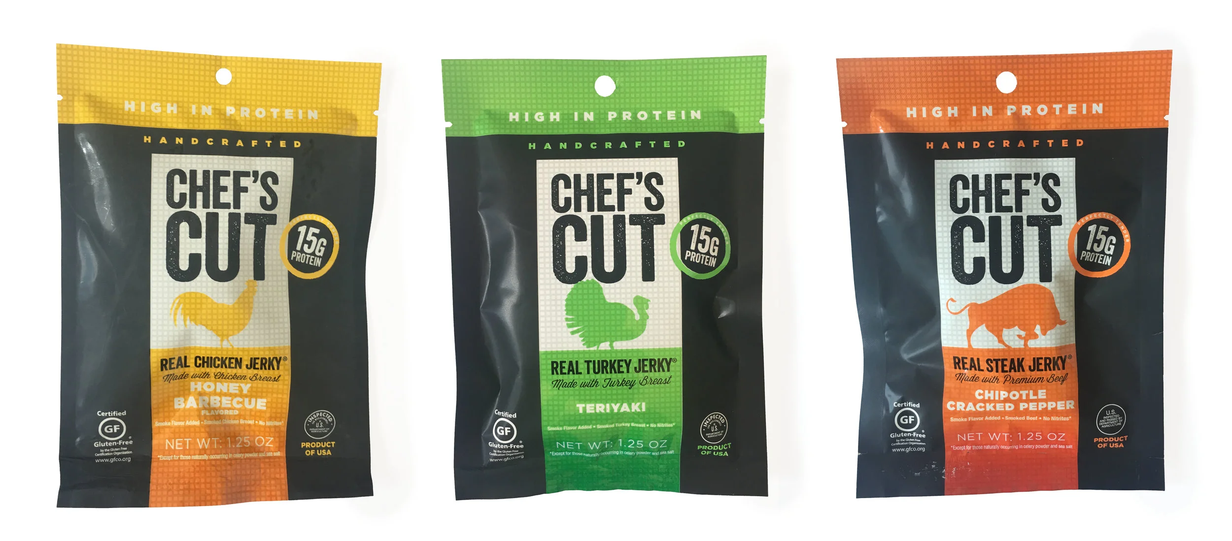
Amidst the visual noise, a few packages manage to cut through the clutter with ease. Take, for instance, Chef's Cut Jerky—a masterclass in effective hierarchy and minimalism. Its clean design allows the brand message to shine through in a matter of seconds, a critical window in today's short attention spans.

In contrast, Martin's apple chips employ a softer, more nostalgic tone, harkening back to a time of locally farmed ingredients. Hand-lettering remains a prevalent trend, adding a touch of authenticity to packaging designs.
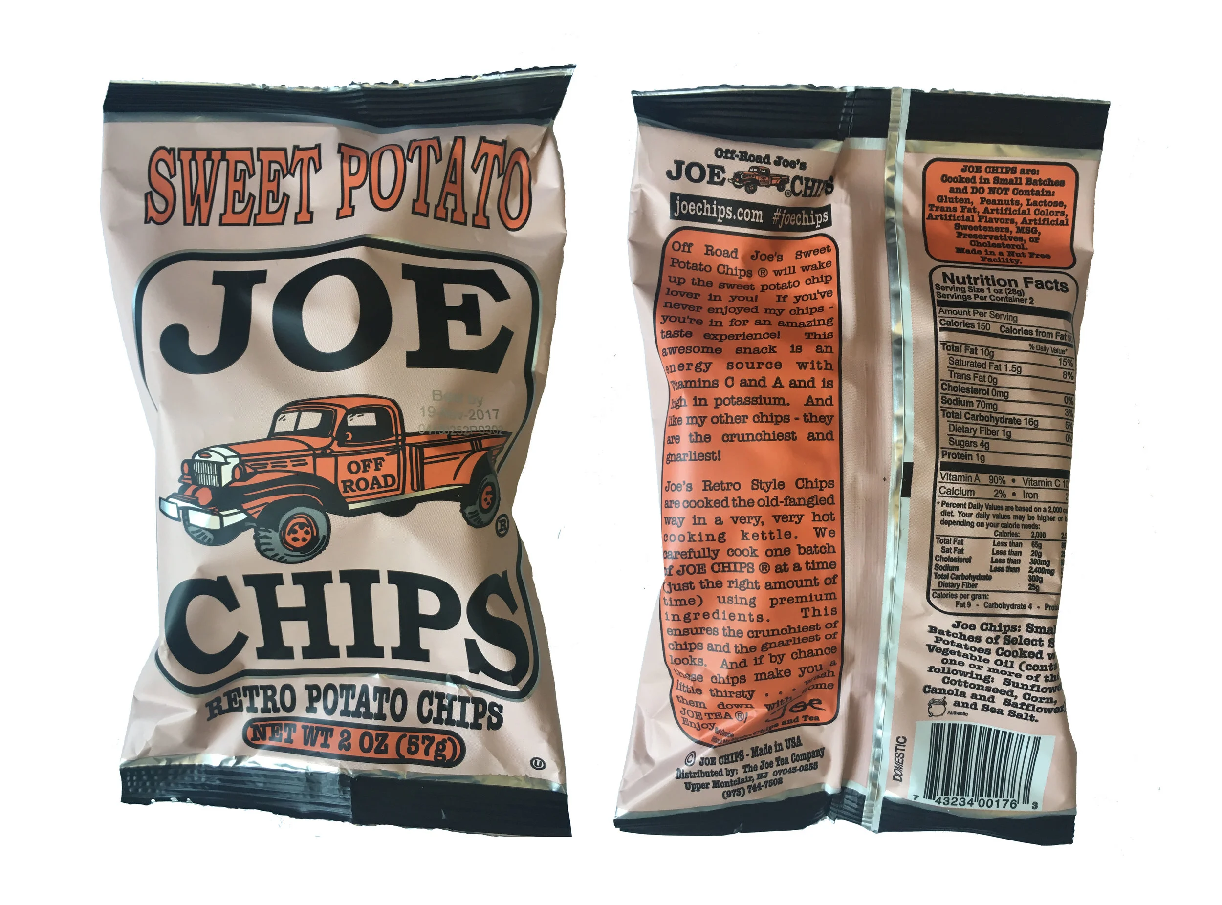
Spot gloss and foil accents are on the rise, adding a touch of luxury to otherwise mundane packages. Joe's Chips, with its vintage truck illustration and oversized block type, exudes a wholesome, nostalgic charm reminiscent of the 1950s.
Behind these successful designs lies extensive research and a commitment to authenticity. In a consumer-driven world, staying true to your brand's identity is paramount. As my mom always said, be yourself—your brand will thank you for it.